
 * You like that blog post title? I have more where that came from, even more ridiculous than that one! I’ll tell you how I got it with a fun link at the bottom of this post.
If you have dabbled in art then you’ve at least glossed on color theory, aka “put this color with this color and OMG AMAZING THINGS HAPPEN YAY.” [by the way, are there still art classes still happening in elementary schools in the US? For me, that was my first introduction to basic color theory.] Color theory carries over into many aspects of our lives, from our clothing choices to our decor to advertising to even cooking sometimes.
Here’s the thing about “acceptable” color combos, though – trends change. Cultures have different ideas about what works together, and that can change from era to era within each culture – in some, even from year to year. That’s why we can look at neon shades and think “80s” but 10 years earlier it was all avocado, burnt orange, and gold. And when a popular color combination goes out of style, it immediately feels dated and is avoided until it becomes acceptable again as a retro throwback. Some cultures, like the Amish, like plainness… in India, a riot of color can be seen, all piled together sometimes.
In the fiber arts, there’s various trends as well. Some folks really only like to work with natural fiber tones, so gradients of white, black, brown, grey, and reddish tones. And in those limitations of tone, beautiful things have been created, from traditional styles to very cutting-edge yarns and garments. For some artists, having that restriction of palette isn’t a restriction at all, but a welcome challenge – and having the lack of color can really show off texture. Take a look at The Spinner’s Book of Yarn Designs: Techniques for Creating 80 Yarns to see how amazing working in only one color/tone can be. The purity of the white fiber allows the texture to be seen with no distractions.

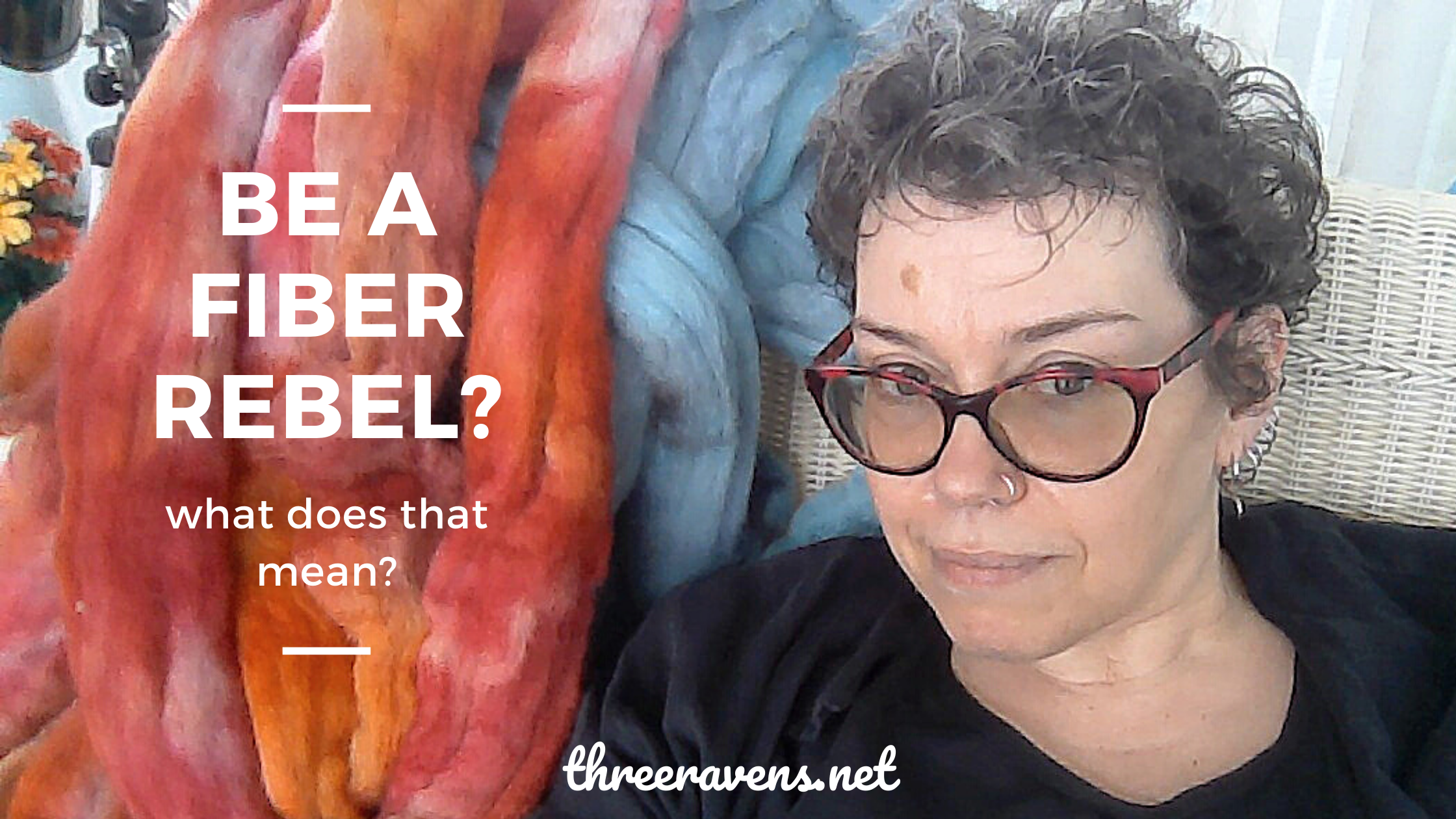
Personally, I enjoy working with color; usually the more color, the better. I’m going to specifially address my fiber batts here, as it’s a bit different when I dye and then spin from top or roving. My personal color theory goes one of two ways: either I work in a color family, adding either black or white to the base colors to create more complex tints or shades… or I work with a variety of clear tones in a jumble that seem random when I’m carding, but work out in the finished product to be vibrantly pleasing. [or as Rob always says, “I watched you put those colors together and I just knew they would clash… but they don’t! How do you manage to always do that?”]
In the jumbled-color batts, I do sometimes use black or grey or white, but I use those as a background for the other colors to stand against, rather than blending them in, like I would in the tonal batts. I find that using a background color can assist the color mix in playing well together. But in my Box of Crayons battlets, which are a riot of just what you’d think – crayon shades, primary and secondary colors – the colors are thrown against each other in a way that many might think wouldn’t work… and it does. However, I wouldn’t ply singles spun from Box of Crayons batts, unless I plied against a neutral white or black ply, simply because it would go just too crazy for my comfort otherwise. Your mileage? It may vary.

You can see some examples above of how I handle color. None of these yarns were tamed by plying against a neutral yarn; I decided to either chain ply for maximum color stretches, ply against a thread or commercial yarn that let the main ply star in the yarn, or ply against another ply – often from a totally different batt, with one or two matching shades between the two. What I’ve found is that, for me, working *with* the color extremes, rather than trying to tame them, has become a trademark. I’m not afraid of the colors, and I think that the end product attracts people with its boldness and colorplay. [for the record, every one of these yarns sold immediately, if that tells you anything.]
So what are the color combo taboos? People will tell you: Don’t mix too many colors. Don’t work with a lot of color without a neutral to balance them. Don’t drift away from tonal blends. Don’t combine too much color with texture. Don’t experiment.
Booooooooooooooooooooring. DO IT. Play! Have fun! Use the color wheel as a jumping-off point, and then throw a color in the mix that you feel is unexpected. Put your hot pinks and yellows together and enjoy the riot. And don’t feel that you have to follow rules, because in experimentation comes breakthroughs.
Oh yeah, and the post title? Thanks to That Super Girl, I found this hilarious yet totally useful website, Portent’s Content Idea Generator. I already was working through this post in my head, but I wanted a catchy title for it, so I plugged in “color in yarn” as my phrase, and the above title was the one I decided to go with… but I really need to share some of the others with you, because OMG hilarious.
“How to Make Color in Yarns as Fierce as RuPaul”
“What Wikipedia Can’t Tell You About Color in Yarns”
“How Color in Yarns Can Keep You Out of Trouble”
“Don’t Hold Back Your Color in Yarn”
“How to Cheat at Color in Yarns and Get Away with It”
…and at this point, I think I broke it.
“How Color in Yarns Can Keep You from Color in Yarns”
Actually, that makes sense, in a weird way. Maybe more like “How your beliefs about color in yarns…”
Anyway, I hope that this bit of musing inspires you to break out of your color ruts, whatever they may be!


